Colour Scheme Designer
ezguide
easy to follow step by step guides
easy to follow step by step guides
The colour scheme designer is a powerful but very simple tool enabling you to personalise the colours in your website by creating a professional colour scheme to use throughout your pages
All designs come with a standard colour scheme created by our designers to achieve a professional harmonious effect and to suit the imagery used in the design. The latest designs, such as Social colourMAX also come with alternative themes including different imagery and colour schemes to match. You are not however restricted to the colours in these schemes, and this Colour Scheme Designer allows you to change them to suit your own images or just to match your business colours or personal preferences. This guide contains the following sections.
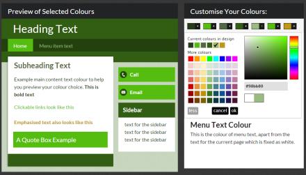
Designing a colour scheme is not exactly the same thing as just choosing colours as you go through your website. If you pick colours on an ad hoc basis as you write and update your website contents, its very easy to end up with a mishmash of style that is untidy and offputting for your visitor. Much better and more professional, is to think ahead about the types of content you will be using, and choose a colour for each that you apply consistently. The Colour Scheme Designer makes this very easy to do, by allowing you to set colours for these frequently used elements of typography:
Using the Colour Scheme Designer you can set a colour for each of these, and then by using the appropriate code in your content you can create subheadings, Linknotes, emphasised text etc.
Remember that each typographic style has a purpose and if you use it for that purpose you will enhance the professionalism and readability of your website. However, you can make a website look worse by using these styles inappropriately.For example, just because you find Quote Boxes an attractive feature don't overuse them or use them for normal text. Similarly don't emphasise everything or you end up with nothing emphasised! Remember, less is often more, and its better to allow your words to communicate your message rather than distracting the reader with unnecessary frills.
The first time you use the Colour Scheme Designer you will be presented with a message like this.
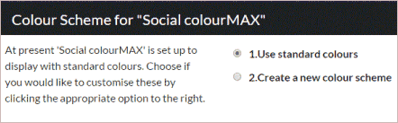
Just click Create a new colour scheme and the designer will appear below. Note that our system has a storage area to hold only one set of colours, and which is linked to a specific design. So if you set a colour scheme for one design , say Social colourMAX, and then switch design to say Mobile colourMAX, the Mobile colourMAX design will be shown with standard colours not your customised colours. If you were then to customise the colours for Mobile colourMAX and switch back to Social colourMAX, the colours would revert to standard. In other words you can't have two customised sets of colours for two different designs.
Now you will see the designer, looking something like this.
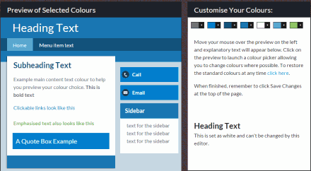
The explanatory text in the right hand panel should tell you everything you need to know and the basic usage is very straightforward. Roll your mouse over the preview on the left and click the colours you want to change. A colour picker will pop up in the right hand panel allowing you to change the colour which will update live in the preview. When you are happy with the colour pick OK. For example here's a screenshot as we change the blue heading area to a darker shade.
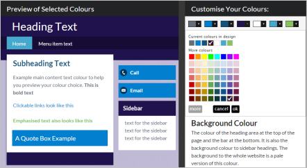
Once you have made all your changes click Save Changes at the top of the page.
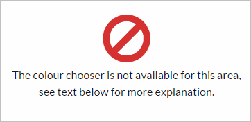
Although there is a lot of flexibility with the designer, some limitations were necessary to avoid overcomplicating the system and for technical reasons. After a while you will find there are two types of situations where you don't have complete control over colour.
You will find that if you try to change a linked colour or locked colour a message will appear in the right hand window like this.
If it is important that you have complete control over colours there is an alternative, which is to use the services of one of our design partners. It probably is not worth it if you want to change just one colour due to the effort involved in recoding the design, planning and coding for all scenarios (such as differences for mobile) and testing for unexpected side effects. However, if you want something highly individual and distinctive our designers have a lot of flexibility to create a design to meet your needs.
In the above simple example we picked a different shade of blue from the palette of options, but you can get even more fine tuning of colour by clicking the more button which reveals the spectrum colour chooser.
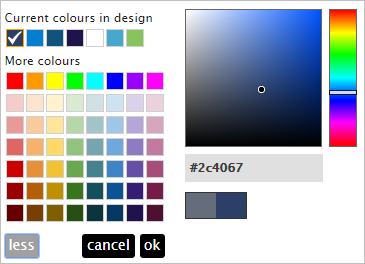
With the spectrum open, you can click anywhere in the graduated colour box and drag the black circle where you like to select the exact shade you want. You will spot that moving to the right makes the colour richer and more vivid, whereas to the left the colour is greyer and more muted. Similarly moving up makes the colour lighter or paler until it is almost white and moving down makes it darker until it is virtually black. In the top left the colour is always white and in the bottom right its always black.
In the above example all the colours are shades of blue, but if you'd like a shade of red just drag the slider bar up or down the right hand rainbow column. This slider bar changes the hue, and the spectrum changes the shade. It will take a little getting used to, especially if you're looking for earthy colours like brown - move the slider to around the red/yellow border and you'll find brown in the orangey shades of the spectrum.
Now that you know how to change inidivual colours, you need to give some thought about your overall colour scheme. Here are a few tips:
Follow the steps in this example to see how you can create a palette of harmonious colours. Let us assume we want an earthy green looking design overall to match a landscape scene photograph.
If you follow the above example you'll end up with something like this. Don't forget to click Save Changes at the end !
We'd recommend following this example through, as it is a good procedure for creating an overall look that works. Once the scheme is done, it is a simple matter of using the appropriate codes for Quote Boxes, Emphasised Text, and making use of separate paragraphs for subheadings and your content will automatically style in a consistent professional manner.
As soon as your new colour scheme is saved, you will see most of the colours on your live website update immediately. Here are a few tips to ensure everything works just as you are expecting.
If you have coloured any items of text using the above HTML code, now is the time to remove it as it will override the new consistent style you have created. In addition the HTML code FONT is being phased out as valid HTML and in future will stop being recognised by browsers, in favour of this new style of colouring. If you want to colour individual items of text use the <EM> code as explained below.
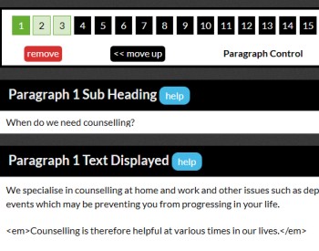
A subheading is just a line of text to introduce and summarise a section, but it helps if all subheadings have a consistent style for ease of reading. You can use the HTML codes for bold and big, but its much better if you create paragraphs using the Paragraph Control Tool and then give each paragraph a subheading in the dedicated subheading field (see below for an example). This way all your subheadings will have a standard enlarged size and will be automatically coloured according to your new colour scheme.
When colouring text, consistency is important to ensure a professional appearance that aids reading rather than obstructs. So even if you have a fondness for the vibrant and multi coloured, remember your readers. By defining a single colour for emphasised text, you no longer need to think about what colour to choose for emphasised text, you just wrap the text in the EM code and all emphasised text will take that colour from your scheme (see below for example). In future if you decide to change the colour of emphasised text, change it once in this Colour Scheme Designer and it will change throughout your website, which makes life much easier!
The other typographical elements which the Colour Scheme Designer allows you to choose colour for are Linknotes (clickable links to other pages of your website or other websites) and Quoteboxes. We have more information about creating and using these in other guides. See the Quoteboxes guide or visit the Linknotes section of our Help Guide.