Visitor Activity
ezguide
easy to follow step by step guides
easy to follow step by step guides
If you want your website to be effective it is important to keep an eye on viewing patterns, not just total hits but trends over time and which pages people are responding to.
The visitor activity section of our Administration Area is one of the most frequently visited by our clients, particularly those keen to achieve results from their website rather than have it just sit as an online brochure. We have said in a number of our guides that a website requires nurture to be successful. If you are starting out you won't necessarily know what you want to show and say and how best to present your service. Your ideas will develop over time and with the help of the WebHealer support team and as they do you should see your visitor activity increase.
The increase should come from an improving search engine position and visibility on the web as well as more compelling content which encourages visitors to read more pages. A trend of increasing page views is one reassuring sign but another equally important indicator is how your visitor activity breaks down. This guide will give you answers to questions such as:
In this guide we will show you how to navigate around the visitor activity page as well as how to make the most of it, in terms of suggesting the kind of analysis you can do and how you can use that information. This guide has the following sections.
The term hits is often used when measuring website activity. We choose not to use this as it can be misleading. Technically if a visitor views a page containing (say) 9 pictures that equates to 10 hits as each of the images as well as the text creates a request (or hit) to the website server. In fact its probably more than 10 hits, hence our decision to focus on page views which is simply a visitor viewing any page of your website. The final term we'll use is Website Visits which ignores how many pages someone views once they land on your website. If they arrive and view 10 pages or they leave immediately after opening the home page it still counts as one website visit. Analysis of website visits is only available for clients with our Premium Service or who have taken up our Reporting Pro option.
Visitor activity can be accessed from the main menu after you log into the Administration Area. Initially you will see a webpage similar to the example below showing a black navigation bar above a trend chart (the graph in green) and a pie chart (round with coloured slices). We will now explain the various options and how to navigate between them.
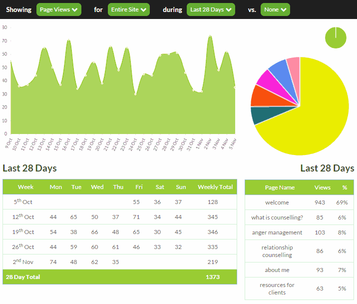
The Visitor Activity page gives you a lot of options so the first thing to draw your attention to is the black navigation bar starting with the text Showing. This navigation bar explains what is currently showing in the two charts below as well as giving you pull down options for alternative charts. The example above is what a typical client might see when opening the Visitor Activity page. It says that we are showing total page views for all the pages of the website on a day by day basis over the last 28 days. The final option called vs. is initially set to none but provides the option to overlay additional comparison data as explained further on in this guide.
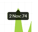 Underneath the navigation bar is the trend chart (the green graph) which shows how daily page views have fluctuated over that 28 day period. You can see it varies between around 30 and 75 page views per day. There is a small blob at each data point and if you hover your mouse over this you'll see the exact number appear on the chart. It reveals that the maximum is in fact 74 pages viewed on November 2nd.
Below the trend chart is a table showing the numbers which produce this chart starting on Friday October 9th. On the right hand side of each weekly row is the total for that week and on the final row you can see that the total for the period (of 28 days in this case) which is 1,373.
To the right of the trend chart is a pie chart. This also shows data for the 28 day period, but rather than breaking it down day by day as the trend chart does, the pie chart breaks down the total 1,373 page views according to which pages were viewed. The slices of the pie progress clockwise from 12 o'clock according to the pages of your website, so the first yellow slice refers to your Home page, the second teal coloured slice refers to your second page which in this case is called what is counselling?
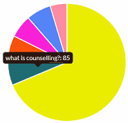 If you hover your mouse over each slice of the pie chart you will see that the name of the page corresponding to that slice is revealed along with the page views achieved by that page. In the example alongside you can see that the what is counselling? page was viewed 85 times out of the total of 1,373. You may also notice that the mouse pointer turns into a hand, which means that the area is clickable. We'll come onto that shortly.
The pie chart instantly reveals which pages are getting the most activity. The biggest slice will almost always be your home page, but you may be surprised about which of your other pages prove most popular. If you create a page that you hoped would be popular but turns out not to be, remember that it doesn't mean they don't like the content of the page. It may be that they didn't spot the page link in your menu or didn't know exactly what the page was about. You can then experiment with making internal links or putting features in the sidebar of your website to draw attention to it. This example demonstrates how you can use the Visitor Activity to improve the effectiveness of your website.
To save you holding your mouse over every slice and making notes, you will see underneath the pie chart a table of all the numbers which create it. In addition you will see that important percentage figure. In this example the home page does represent a substantial 69% of page views which is a little high. Some work should be done to improve that until it is in the 50%-60% range.
There are two ways of navigating around the Visitor Activity page in order to generate different charts and analyses. The primary method is to select from the Navigation Bar or you can click on the pie chart. It really depends what kind of questions you'd like to answer.
In general you will be using the visitor activity charts to answer these sorts of questions
To explore trends you will be using the main navigation bar, as this will give you access to different time periods for comparison.
Initially the trend chart shows 28 days of page views but you can change this by clicking on the button to the right of during and changing it from Last 28 Days to another time period. If you select Last 12 months your daily fluctuations of activity will be smoothed out so that you can see the general trend over time as your website matures and hopefully increases its overall web presence. You may hope to see the benefits of additional marketing activities by viewing over several months instead of just looking at days. You can also pick individual months in order to go back and see how your website performed up to 12 months ago.
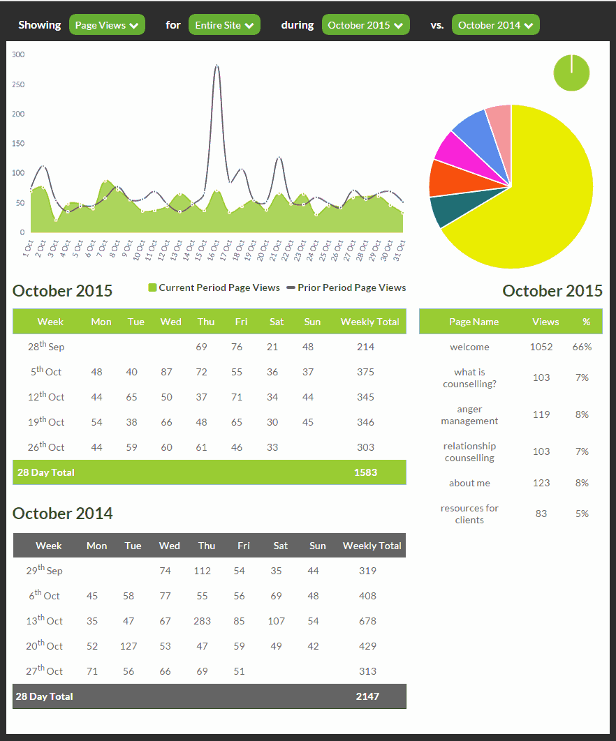
So far we haven't shown the comparison overlay feature. You may for example feel that your website is doing badly at the moment and you would like to see how it performed in previous periods. That is the role of the pull down option to the right of vs. The options you see there will vary according to how much prior data exists and what the current trend period is. If you are showing Last 28 Days you can click the vs. option and show an overlay of Prior 28 Days. If however you were to show data During a particular month, say October 2015 for our example here, you could then select a vs. overlay of either the previous month (i.e. September 2015) or the same month in the prior year (October 2014). In the chart below you can see we have done that and the trend does indeed show that website activity is a little slower this year. This is true even if we exclude the spike on October 16 last year which may have related to a marketing event, such as a Twitter message. We have seen that the website had 69% home page views so one possible explanation is that this website is becoming dated and attracting less interest.
Although you can use the navigation bar to select individual pages instead of Entire Site you may find it easier to use the pie chart. In our example perhaps we're interested in how our anger management therapy is developing - represented in orange on the pie chart. The pie chart shows us that it has had 103 page views in the last 28 days and is proving more popular than relationship counselling. We would like to see if it has been growing though so we can simply click on the red slice of pie to redraw the trend chart. The daily numbers are however quite low now and there is a lot of fluctuation so we'll switch to an annual view and to see how things have developed we'll add an overlay of Prior Year. The chart drawn now shows monthly page view activity compared to last year.
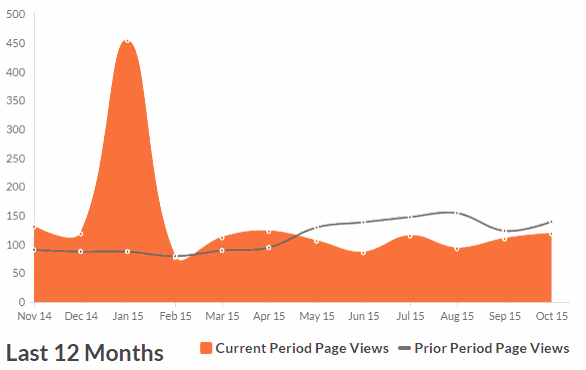
The most striking feature is the peak in January this year which may related to the post Christmas period. There also tends to be slightly more page view activity overall and this is proven by the table of numbers (not shown above) which says that page view total has gone up from 1,368 to 1,647.
We have already shown that a quick glance at the pie chart reveals the distribution of page views across your individual pages. You may also have spotted that the pie chart also redraws for any time period which allows you to answer questions such as:
The numbers are not live. The data to draw the charts and tables is recalculated daily during the night.
Fundamentally a website visitor is anonymous which creates difficulties in distinguishing visits made by your potential clients as opposed to your own visits or visits by the WebHealer support team. There are some technical solutions which we are working on that will help, such as allowing you to designate a computer that you use regularly and creating a mechanism to exclude that computer. Bear in mind however that there are other kinds of visits that skew the data too and are just as problematic if not more. These are from 'bots' or systems which scan the web and look at pages automatically. Google use these to determine how you should list, but so do many other search engines and web services. Some of these declare themselves as being 'non human' but many don't. Again we are working on ways to filter them out, but there is no perfect solution. For this reason the actual number that you see will not equate to real potential clients. It is better to look at trends and patterns of growth to get a feel for overall progress.
This is rare but it does occasionally happen. The reason is that new pages may be added or removed over time, whereas the total page count is stored separately. The total page count may therefore include page views for pages which are no longer showing.
We offer more advanced reporting that also shows website visits and if you subscribe to our Reporting Pro option or our Premium Service you'll see additional options in the navigation bar as explained in the next section. If however you're hungry for more in depth data and are comfortable with much more technical reporting tools you can add Google Analytics to your website.
Google Analytics
To use Google Analytics you will need to set up your own analytics account with Google. This will give you a login to see the data and the reports that Google will produce for you. It is also necessary for the installation of Google Analytics on your website, as Google will allocate you a unique tracking code. You need to send us that tracking code, so we can switch it on for you and add the coding.
Please note that all support for Google Analytics is provided by Google directly, through their Google Analytics website. It is an extremely sophisticated application, and the WebHealer team do not have the necessary training to provide assistance.
If you have subscribed to Reporting Pro or our Premium Service you will find that the pull down option to the right of Showing has another option called website visits. The trend chart will draw in a very similar way but instead of using page view data it will use website visit data. The advantage of this is that it ignores visits to internal pages so that you are more clearly seeing how many people are finding their way to your website as opposed to how effective your website is at engaging their attention.
With website visits the concept of page breakdown has no purpose so the pie chart takes on a very different role. The slices of the pie instead correspond to where the visits came from to the extent that this can be determined. For example Google or a directory listing. Please note that for the visitor source analysis to track individual sources you need to inform the WebHealer support team of where you have listed your website and then our system is capable of identifying if the visitor came from that website and building data for this report.
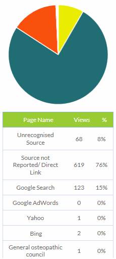 This example shows how the largest identifiable source of website visits was Google. The example also shows that the biggest sources are not identifiable, which is typical. These unidentifiable types are explained as follows: